The screen in Ontrack Designer consists of the following sections:
 Screens
The Screens section lists all the screens for Ontrack Staff Hub or Ontrack Learner Hub, ordered by the different sections in the module.
You can search for a specific screen using the search box. For example, the image Screens shows a search for the learner behaviour screen.

Selecting a screen will update the other sections of Ontrack Designer with information relating to the screen.
Screen Details
The Screen Details section of the screen is split into the following parts:
The Parameters section displays the data used on that screen when testing your edits to the screens. This consists of the name of the parameter and a test value for the parameter which would be a valid ID for the parameter. See Context Parameters for more information.


The Pages section displays the different types of page for the screen. These pages are usually for each of the different locales with different fields on each page.

Using the Pages section you can set which roles can view the page. If you want to prevent users of a role being able to see a screen, you can set the role to the AccessDenied page.

Page Details
The Page Details section contains the different data links and controls on the page.

When you select on a node, one of the following sections will display:
There are a number of properties for a page that can be configured as required. To access the properties, select the expander button on the Page Details section header. Selecting the expander again will hide the properties section.

The Id, Version and Status fields are read-only and only used for information purposes, but you can make changes to the Description field and the Requires Refresh check box.

The Description field defines the label that is used to identify the page in Ontrack Designer.
The Requires Refresh check box defines whether the page needs to refresh when the context parameters change. This is typically set for context and report link pages that need to refresh when the context for the main page changes. For example: a learner contexts page can be configured to dynamically display the number of enrolments for a learner on the page. This will need to refresh to display the new number of enrolments when a different learner is selected.
Page Layout Details
The Page Layout Details section is selected by selecting the top node on the Page Details section of the screen.

This will display the Page Layout Details section.
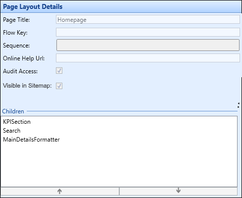
From this section you can edit the page title and change the order of any controls that are associated with the page using the up and down arrows under the Children grid. You can enter the flow key and sequence for the page as part of the configuration to collect information for a record over multiple pages. You can also define whether the page is visible in the Ontrack Staff Hub sitemap.
Data Link Details
The Data Link Details section is selected by selecting a data link in the Page Details section of the screen.

This will display the Data Link Details section.

The fields on the Data Link Details section are described in the following table.
| This field | Holds this information... |
|---|---|
| Name | The name of the data link. |
| Data Source | The data source containing the data you want to display. See Manage Data Sources for more information. |
| Expected Result Type | Whether the query will return a single row or multiple rows of data. The choice made here will determine the icon used to represent the data link (either a single column or two columns). This allows you to see the different types of data links at a glance. |
| Description | The description of the data link. |
| Maximum Rows | The maximum number of rows to return from the data link. If left blank, the query will return an unrestricted number of rows. |
| Collection Name |
The collection name which is used to change the xml entity surrounding data that is returned from the REST service (for example: this is the data returned from a data link called persondetails where collection name has been set to 'PersonDetails'). Important.This could be used if calling REST services directly (for example: outside of Ontrack).
|
| Item Name |
The item name which is used to change the xml entity surrounding data that is returned from the REST service (or example: this is the data returned from a data link called persondetails where item name has been set to 'ColumnName'). Important.This could be used if calling REST services directly (for example: outside of Ontrack).
|
| Is Anonymous Access Allowed? |
Whether to allow anonymous access to data (that is: make data available without authentication). Important.This check box is not set by default, including for any existing data links in the system. It is recommended to use this functionality with caution (that is: only expose data that is appropriate to potentially be available publicly).
|
| SQL Field |
The SQL query that retrieves information from the data source selected in the Data Source field. Important.You cannot use semi-colons in the SQL code.
|
| Validate | A button that checks the validation of the SQL in the SQL field above it. Read-only text displays next to the button, showing whether the SQL is valid or not. |
Control Details
Controls are the elements on a page that are used for entering or displaying data. The Control Details section is selected by selecting on a control in the Page Details section of the screen.

This will display the Control Details section.

The contents of this section will change depending on the control selected in the Page Details section.
Column Details
The Column Details screen is selected by selecting a column in the Page Details section of the screen.

This will display the Column Details section.

The fields on the Column Details section are described in the following table.
| This field | Holds this information... |
|---|---|
| Span and Offset |
Where the control sits on the different screen sizes. Select from one to twelve for Span and one to eleven for offset. Important.There is no offset for Extra small as there is no space to use.
|
| Visible Extra Small | Whether the control will display when viewed on an extra small phone. |
| Visible Small | Whether the control will display when viewed on a phone. |
| Visible Medium | Whether the control will display when viewed on a tablet. |
| Visible Large | Whether the control will display when viewed on a PC. |
| Required Licence | This field is not applicable. |
| Is static text | Whether the column holds a hard-coded value. |
| Display Text | If Is Static Text is set, the text that displays in the data column. |
| Small Device Text | If Is Static Text is set, the text that displays in the data column on a tablet or phone. |
| Type |
The type of column. Select from either Text or Image. Selecting Text will display two extra fields at the bottom of the section.
Selecting Image will display three extra fields at the bottom of the section.
|
| Header Type | The size of the header for the column. |
| Web Service Field |
The REST service field to write-back to the relevant REST service (that is: updates to the selected field will call the appropriate REST service). Select from the drop-down list. Important.This field is controlled by the OntrackWriteback licence. If the licence is not enabled, the Web Service Field field is greyed out.
|
| Style | The CSS style to be used for this control. |
| Editable | Whether fields in the column can be edited. |
| Required | Whether fields in the column must have a value set in it. |
| Always Send to Web Service | Whether to force data to the web service as part of the write-back process. |
| Hide the column if the contents are empty | Whether the column will be hidden if there is no data to display. |
| Exclude this column from being exported | Whether to exclude a column in a grid from an export. |
Navigation Graphs
The navigation graph is a graphical interface which illustrates the path you can take through Ontrack Designer. To view the navigation graph for a role, select the Navigation Graphs tab at the bottom of the screen.

The screen consists of two sections. The left side of the screen displays the list of primary roles for Ontrack Staff Hub and Ontrack Learner Hub. Select the role you want to view the navigation graph of by selecting on the role once.

The graph shows the path through the menus of Ontrack Staff Hub and Ontrack Learner Hub. You can expand the navigation links for each page by selecting the check box on the page you want to view in more detail.

You can expand an entire tree on the graph by select and hold (or right-click)ing and selecting the Expand entire tree option. Alternatively, if you only want to view the currently selected tree, select the Expand all children option.

To collapse a node, deselect the check box control.
Each of the pages displayed on the Navigation Graph screen are colour coded as follows:
- Red - the page is set as Access Denied for this role
- Blue - the currently selected page on the Navigation Graph screen
- Green - the currently selected page in Ontrack Designer
